
May’s theme / technique: It’s all about the Light
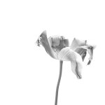
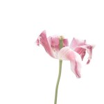
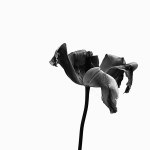
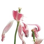
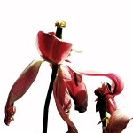
Take Two: Not being totally happy with the tulip example I provided earlier today I went out into the garden this morning to photograph a couple of tulips in decay and an allium. The tulips were pretty much falling apart and I knew they wouldn’t make it indoors so I took my trusty servant assistant armed with white paper to provide me with a blank background. And then I went indoors, downloaded the images and played around with the lighting and colour.
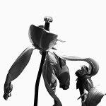
This week's assignment - Create one image using strong lighting which creates strong shadows and emphasises contrasts in tones and one image with much lighter tones. If you have post-processing software try experimenting with 'low key' and 'high key'effects.
-
- The visual effect of deliberately shifting the key tone (the one which lies near the mid-point between the darkest and lightest tones) is not to make the image lighter or darker overall, but to signal a mood or feeling in the viewer.
- The mood of low-key images becomes more sombre and metaphorically darker, with more drama implied.
- High-key overcomes shadows and signals a style full of light and air. Look for subjects with a relatively small difference between the brightest and darkest parts.
(1) Tulip
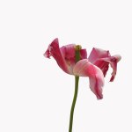
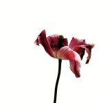
(Please click on an image to enlarge.)
(2) Tulip
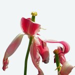

(Please click on an image to enlarge.)
(3) Allium
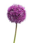
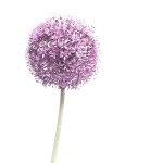
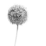
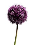

(Please click on an image to enlarge.)
I would be very interested to hear your opinion on these images. And I will be back with an alternative view of this assignment later in the week.
If you would like to join in with the 2020 photo challenge then please take a look at my 2020 Photo Challenge page. No complicated rules, just a camera required 🙂
-
- Create your own post with some information about how you composed the shot.
- Include a link to this page in your post so others can find it too
- Add the tag #2020PhotoChallenge so everyone can find your entry easily in the WP Reader
- Get your post(s) in by the end of the month, as the new theme comes out on the first Sunday in June.

To contradict myself within a few minutes of my last comment, I quite like the high key ones here. Quite surprising really!
Makes it easier without the background! I actually like the darker ones better, I even like the B&W which is unusual for me as flowers rely mainly on colour for their impact. These are very arty shots though.
Speaking of Sue, she will adore your collapsed tulips. Me, I’m a bit conflicted, but admiring of your trusty assistant 🙂 🙂
The man did good 😁
Well, you already know which ones I like best… 🙂
Best wishes, Pete. x
I do indeed. 😁
High key best with the white background, but where was the light coming from?? I like that you sent your servant oops, Assistant out with the white paper!!
The light was from my right (south-east), I had to move so I didn’t get shadows on the paper.
So, sidelight….
Yes. Is that a good thing? Seemed to create nice shadows on the flowers.
Sidelight is good for showing derail, eg textures
For me, the High Key Colour wins in all the shots. I have used paper in the past, makes a huge difference making the subject stand out far more. The allium which looks like garlic flowers is my favourite.
The allium has come out well. I like the softer tones on that one too.
Soft tones for flowers seem to suit them in photographs. Whereas in real life they look amazing when bright and colourful in a garden.
Your “assistant” did a great job!
I couldn’t have done it without him! Those tulips would never have survived being picked!
ah now these totally help me understand the effects you mean. Huge thanks to your fabulous assistant . . . . .a little part of me though is now hankering after the version one backgrounds 😉
These are very much ‘studio’ shots which isn’t really me although I do like the way they look and they would probably be rather nice enlarged and printed as cards or even a wall print.
Ooh yes on a wall, or cushions 😀
Cushions would be nice.
This is not helpful of me, but I can see it will depend on my mood which is favourite. My mood at the moment favours low Key. As me again tomorrow.
I like most of these as art shots, not what I’d call realistic. The dark tones and the B&W are my favourites.
I’ve been looking at them for a while now, trying to decide if one is ‘best’ but I like all the variations actually. Your assistant (willing?) did a good job there. 🙂
He was sort of willing and held the paper very still 🙂 I like them all too in the form of art.
I suppose he couldn’t be seen to be enjoying the job too much for fear of you asking him to do it again! 😀
G’day Jude. Well I really bombed out last week. Weather was overcast and no consistent sun for a full day’s contrasts, and nothing in my archives that would fit the brief. This week is the same, even raining the past few days, definitely needed the rain. I’m happy because just put all my spring annuals in. But not good for photography. Another problem is I don’t know how to use software to manipulate for high and low key. 🙄☹️Went to google but it all seemed too complex. Do you have any simple ways of doing it?
I admire all your samples, I actually liked your take #1, and I prefer the dark dramatic low key affect. Very interesting to see how it alters the mood of the image. Will look forward to seeing your take 3…
What software do you use to edit your photos? I use PhotoShop Elements 11 (an old one) and I can alter light levels. It’s the levels you need to look at. There are three points. Left is dark, right is bright and a midpoint. If you move the midpoint to the left the image will get darker. Move to the right and it gets lighter. My software also has high key and low key effects built in which I have used here. Or does your camera have scenes? Mine has a dramatic effect and a soft focus one.
Of course you can just take photos in bright light so they are overexposed or where there are very dark shadows creating a more dramatic image.
Hope that helps! Just remember, it’s all about the light. So even a dull day might work in your favour here. You might not get dramatic shadows, but you might get a good overexposure.
Thanks for the reply and tips Jude. I have an absolutely ancient photoshop 5… I had a look and fiddled with the levels. But now the problem is I can’t find a suitable photo to work on. I created the low key ok but then the high key just looked so wish washy…🙄 Well next week I think I will have something. Hope your summer is a good one, we now have the cold creeping in from the south, going to be down to 8deg on the weekend. That is equivalent to freezing in this part of Australia. Time to get the thermals out…
You don’t have to post both, just go with the low key example. Low key is trickier, probably best with a portrait shot to create a soft effect, like a baby, or a bride. Saying that I did do one in black and white of my granddaughter when she was born.