
August’s theme / technique: Colour Theory
Colour plays an important part in what we see. Our brains interpret colour far better than our cameras do. Anyone trying to photograph a red rose will know how often the photograph is very disappointing.
Successful colour photography means learning to use colour as a compositional tool – a form of visual communication – rather than just reproducing a scene that happens to be in colour.
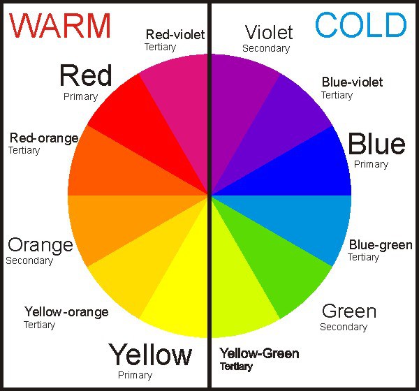
Colour theory is not just knowing what colours are: primary, tertiary etc and how to make them, but understanding cool and warm colours, complementary (next to each other) and contrasting colours (opposites), neutral and bold colours and how colours can affect our emotions or perceptions of a scene.
-
-
- Don’t overdo it. Too much colour or too many clashing colours can be confusing to the eye and create a chaotic scene.
- Consider the time of day and the type of light which can affect how different colours appear.
- If you are not happy with the colour in your image then try adjusting the saturation in post-processing. An image with lower saturation seems softer, dreamy and idealistic. An image with high saturation seems bright and exciting. Think about the feeling you want to convey with your image before deciding how much or how little saturation would best suit the scene.
- Pay attention to the way you frame colour and use light to enhance it.
-
This month's final assignment - Experiment with using two or three Complementary colours. Try to make one or two colours the focus of the image, and use the other colour to enhance the overall image.
Blue and green should never be seen
except with something in between. But nature flaunts that rule.
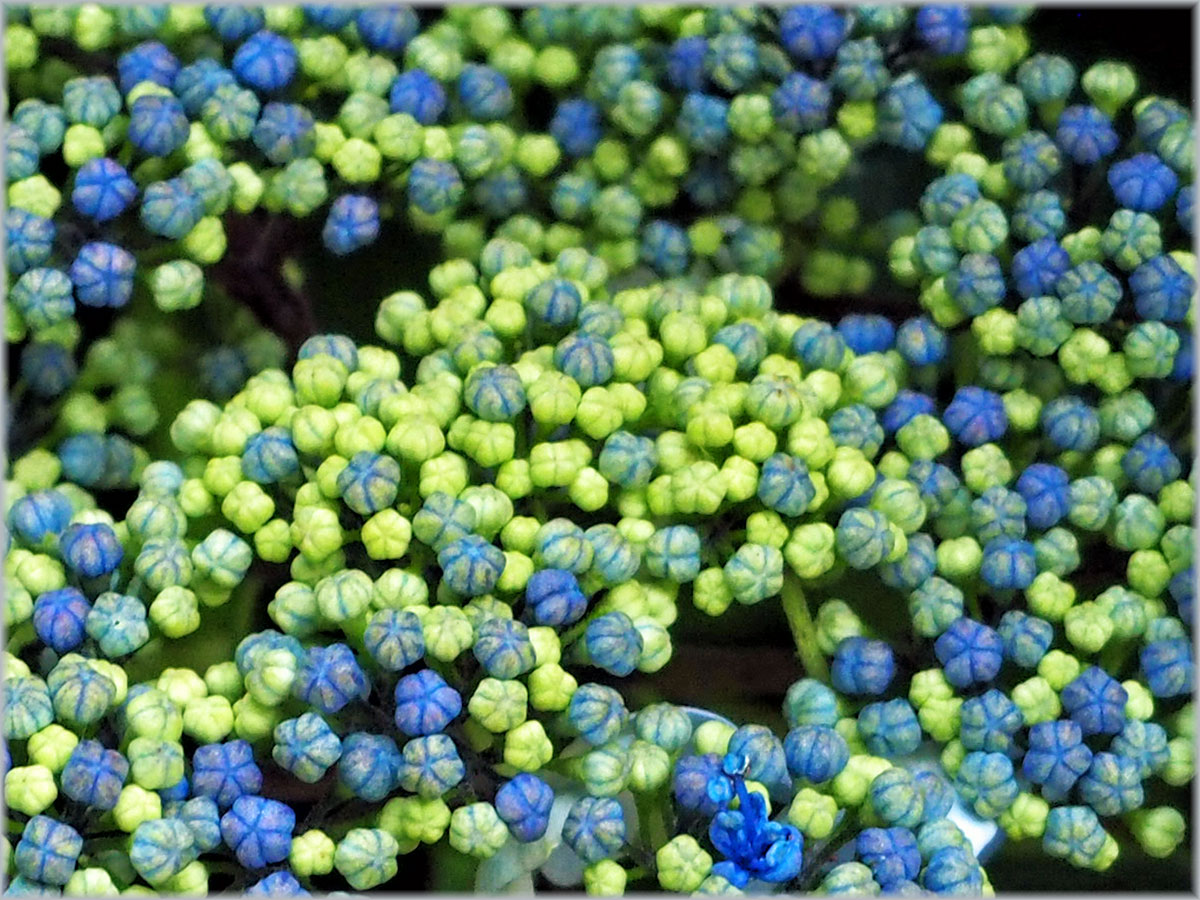
The blues and greens of this lace-cap hydrangea are further complemented by the darker green foliage.

If you would like to join in with the 2020 photo challenge then please take a look at my 2020 Photo Challenge page. No complicated rules, just a camera required 🙂
-
- Create your own post with some information about how you composed the shot.
- Include a link to this page in your post so others can find it too
- Add the tag #2020PhotoChallenge so everyone can find your entry easily in the WP Reader
- Get your post(s) in by the end of the week, as the new theme begins next Sunday on Point of View.
Once again I thank everyone who has taken the time to participate in this month’s creative challenge in experimenting with colour. I hope you have enjoyed the tasks and I look forward to seeing what next month brings. Please visit the links in the comments to check out other blogs.

Never really understood why blue and green should never be seen, I wonder which fashion designer or stylist first came up with it. Clearly they had never seen a hydrangea!
Yes, must have been a fashion designer who never looked at nature!
Oh, love this blue and green, and I’m also with Becky on not understanding why anyone came up with such a ridiculous notion. Now I’m probably going to struggle with this one
Well it does not have to be blue and green. Just two colours next to each other on the colour wheel 💙💚
Oh, I know….
I vote with the others. Blue and green can look great together, though maybe it depends on the shade of each colour.
Best wishes, Pete. x
Mmm… have to think about that.
Susan made a very interesting comment about this.
The hydrangea flowers and their leaves are perfect together. Clashes come from contrasts between specific shades or hues of colours. Looking at your wheel, the red and red/violet seem to clash to me and also the blue/green and green, and the blue/violet and blue because one cannot match the brightness and purity of the other. I am not using the correct terminology as I don’t know it, but some blues don’t look good to me with some greens and the same could be said for almost any other colours. There’s something that balances colour – as if colours have weights or qualities that can conflict.
This is what Pete was thinking. You have defined it perfectly.
I enjoy seeing groups of well matched but different colours. Paint cards do it. Your row of photo challenge squares at the bottom of the post caught my eye with that.
I love poring over a paint chart, my only problem is that being a Libran I am very indecisive and continually changing my mind as to which colour I prefer!
Hmm. We’ve been away this weekend. I’m thinking some of the shots I’ve taken might do- they may be in the brown/khaki spectrum. We’ll see. I’ve yet to download them.
Sounds like you may have some interesting shots.
We’ll see. I’v been downloading them. Lots and lots of grey sky!
I should mention that removing gloves in order to take shots was a chilly process and reduced my wish to do so!
Not warm then? Hope today is better, it’s been gorgeous here since Friday, that was a bit wet and windy.
Today IS lovely. Now we’re back home ….
Always the case 😬
I thought it was red and green that shouldn’t be seen! And you’ve pinched the perfect shots to illustrate with so I might have to go in a corner and sulk 🙂 🙂 Seriously- I’m struggling to keep up with Rjo, let alone anything else. As regards Paula, I did wonder how Covid had affected her always precarious work situation. Perhaps we’ll now find out.
red and green which “should only be seen upon an Irish queen” apparently. Of which I am not. In case you were wondering. No pretty orange / yellow bougainvillea nearby?
A little, but seriously… I haven’t written tomorrow’s walk yet. Need to crack on 🙂 🙂 Got an iced glass of red to help me along.
From a quilting or crocheting perspective, I love blue and green together and also pink and red.
G’day Jude, I am back as I couldn’t resist this assignment. I love the graduated colours in the hydrangea, nature can combine colours so well. Hope all is well in your part of the world. I love colour so here’s some from my garden. https://retiredfromgypsylife.wordpress.com/2020/09/01/2020-photo-challenge/
Oh, marvellous PP. Glad this one tempted you 😁
Finding time to blog is challenging, but I still browse through the posts in the reader, usually when I am having a cuppa
Yes, I’d miss the reading and the comments.
I hardly ever read novels now as I prefer to travel around the world with the blogging community.