August’s theme / technique: Colour Theory
Colour plays an important part in what we see. Our brains interpret colour far better than our cameras do. Anyone trying to photograph a red rose will know how often the photograph is very disappointing.
Successful colour photography means learning to use colour as a compositional tool – a form of visual communication – rather than just reproducing a scene that happens to be in colour.
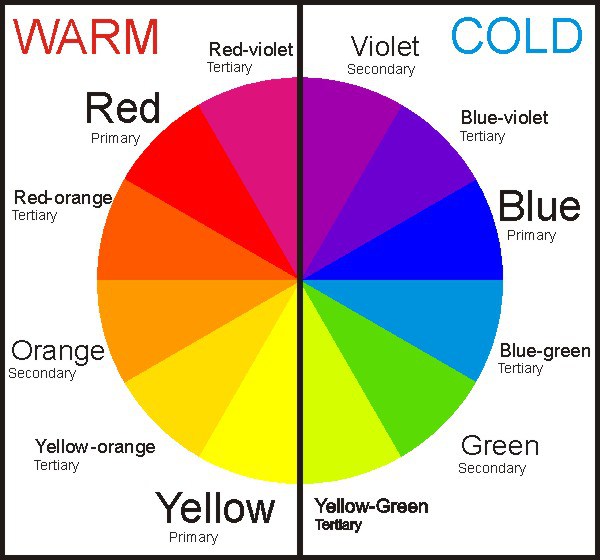
Colour theory is not just knowing what colours are: primary, tertiary etc and how to make them, but understanding cool and warm colours, complementary (next to each other) and contrasting colours (opposites), neutral and bold colours and how colours can affect our emotions or perceptions of a scene.
-
-
- Don’t overdo it. Too much colour or too many clashing colours can be confusing to the eye and create a chaotic scene.
- Consider the time of day and the type of light which can affect how different colours appear.
- If you are not happy with the colour in your image then try adjusting the saturation in post-processing. An image with lower saturation seems softer, dreamy and idealistic. An image with high saturation seems bright and exciting. Think about the feeling you want to convey with your image before deciding how much or how little saturation would best suit the scene.
- Pay attention to the way you frame colour and use light to enhance it.
-
This month's final assignment - Experiment with using two or three Complementary colours. Try to make one or two colours the focus of the image, and use the other colour to enhance the overall image.