
November’s theme / technique: Black and White Photography
Often overlooked black and white offers so much depth and emotion and has a timeless nature to it. It’s about searching for a new perspective and creating a visual that is better without colour. It’s about expressing emotion not just removing colour. It’s not about shooting objects that lack colour to begin with (i.e. a zebra)
“To see colour is a delight for the eye, but to see in black and white is a delight for the soul” Andri Cauldwell
Colours are great, but can add distraction to a photo. Black and White images lack those colours and allows you to focus on the contrast and patterns that you may not have previously noticed.
-
- If the photo lacks definition try adjusting the contrast or using colour filters in your editing software. Yellow will make things appear darker, orange darker still and red the darkest. Green filters can bring out the detail especially in green subjects. Blue filters block red light, making reds darker.
- The best black and white photographs often have clear ‘blacks’ and ‘whites’ to guide the viewer.
- Look for light or dark backgrounds for your photo shoot. Then, simply choose a subject with the opposite tone (light subject with a dark background / dark subject with a light background).
- Silhouettes don’t necessarily have to be shot with perfect backlight if the subject is dark enough and the background is light.
- Tones – the underlying brightness, darkness, and shades of grey that appear in an image. The tones of your image – whether dark or bright – should harmonise with the character of the subject itself. Dark tones can be moody and dramatic, light tones ethereal and light.
What is important though is the composition. Try using a square format to emphasise the composition especially if there is a distinct pattern formation. When you take a picture in monochrome you may have to make different decisions about how you compose the shot.
“One sees differently with colour photography than black and white… in short visualisation must be modified by the specific nature of the equipment and materials being used” Ansel Adams
You can use Monochrome Mode on your camera, or turn colour photos into black and white with your favourite post-processing application.
This week's assignment - Make sure you have contrasts in your image(s). Clear whites and strong blacks will add impact and create attention.
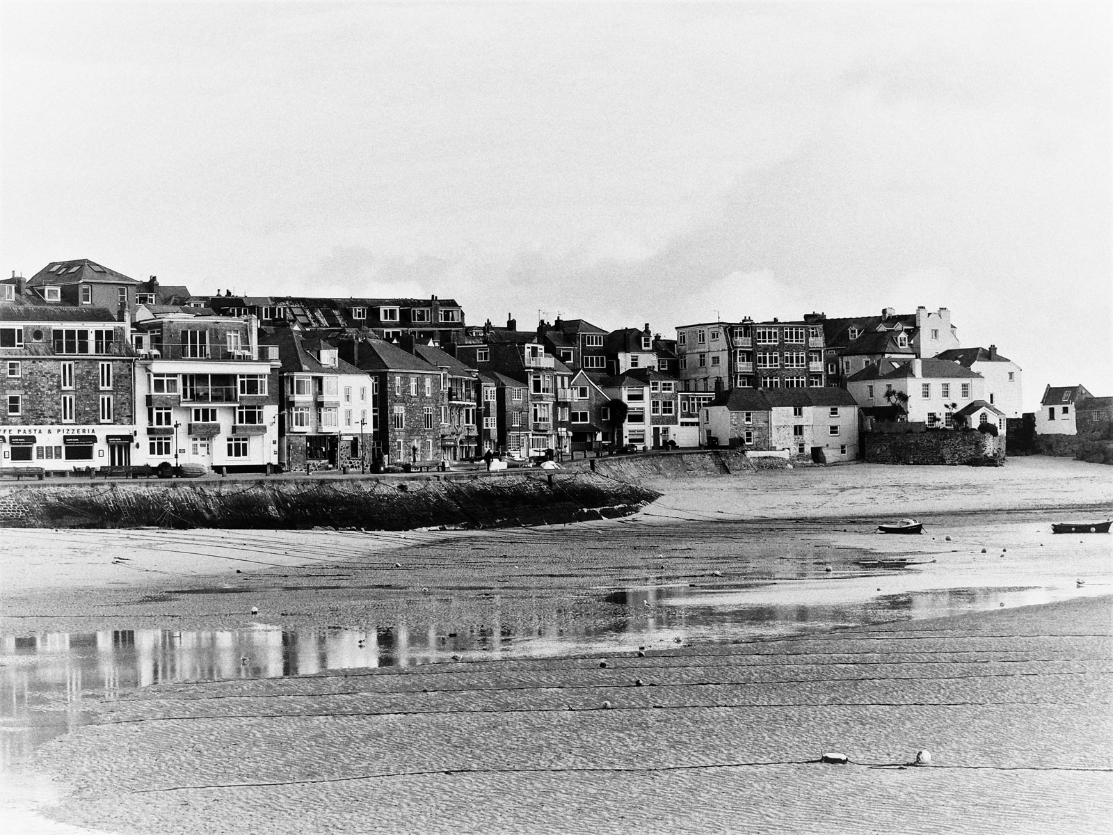
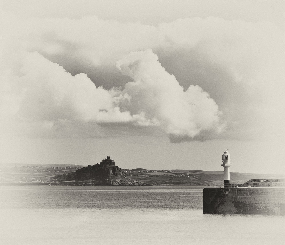
These two seascapes make use of different subjects – the one above uses the colours of the town buildings for contrasts and the reflective water on the beach to create interest. The one below uses the strong, darker shapes of the castle on the mount and the harbour wall and the lighter cloud formations to create interest, the mood is set by using a vintage filter.
If you would like to join in with the 2020 photo challenge then please take a look at my 2020 Photo Challenge page. No complicated rules, just a camera required 🙂
-
- Create your own post with some information about how you composed the shot.
- Include a link to this page in your post so others can find it too
- Add the tag #2020PhotoChallenge so everyone can find your entry easily in the WP Reader
- Get your post(s) in by the end of the month, as the new theme begins on the first Sunday in December.

Love that second one, Jude! It has storybook appeal 🙂 🙂 Happy Sunday!
I’d be happier if the sun would shine so I can get the rest of the bulbs planted. Looks like the day to bake the Christmas cake 😋
And watch tennis 😦 😦
Cake made and baked, Thiem match watched, dinner cooked and eaten, now waiting for the match to start.
Cheer him on for me 😦
No coverage? 🙄
That second one is a story in itself
It’s interesting to see how altering contrasts and light levels can change the mood of an image.
Light is everything
Right. Having a think. I like yours, especially the second one.
I like that too. Had to crop and frame it before deciding on the processing. I have a lovely soft coloured version of St Ives harbour that I might post on the Cornwall blog.
Oooh, yes please!
I’ll try and remember.
Yes, please, twice 🙂 🙂
There is always something timeless about B&W photos. The filter on the second one makes it look like a 19th centruy post card.
Best wishes, Pete. x
I thought you’d like that one. 😊
I was going to say the second photo looks like an old fashioned post card but Pete beat me to it.
It does. And he did. But thank you for liking it too 😊
Fabulous example Jude. I think I found a few
You certainly did! Great interior shots.
It’s all about the light, Jude! And of my three, the light is pretty flat in the first, so not as effective as the other two :
I love them all Sue. Great composition.
Thanks!
Great examples Jude. The sky in the second photo is magical, love it💕
Thanks PP. The clouds were marvellous that day.