
It seems that my idea to split Purple and Violet into separate months is causing confusion and anxiety throughout the blogging community [🤔]. As with any colour we all perceive them differently and add to that the calibration of your monitor or phone screen I suspect it is unlikely that any of us are seeing the same colours!
To try and help matters and because I don’t want to alienate or upset anyone who reads my blog I am declaring May open to whatever shade of purple or violet you wish to share. But violet will still have its own month, mainly because I can’t come up with another colour! But by then hopefully you will have all forgotten and forgiven me the traumatic beginning to May 😂
Darker shades
Lighter tints
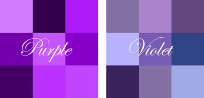
Maybe these palettes will help!

Erm. I’ve a strong suspicion I’ll be submitting the same photos twice. And I’ve just written myself a list of twelve colours, not including violet, but it might not get past your quality control.
I’d love to see your list! Maybe I can eliminate violet! I have doubled up on a few.
How many have you got? I had 11, and my 12th might not meet your criteria but I thought it was quite interesting.
One for each month, but silver and white are together as is black and grey. More controversy ahead!
Not so much controversy as making life difficult for yourself! Yes, my twelfth was the suggestion of gold, silver, or any metallic hue. I can also hear my art teacher at school saying loud and clear ‘there is no such thing as black or white in nature’.
Have you checked out the brilliant link one of Jude’s followers have shared on colour? The final sentence had me giggling as it mentions Kingfishers!
it’s a fab link isn’t it? I am now thinking I have made it far too easy suggesting purple! Plum purple is amazing! The plum blue of Werner, is composed of Berlin blue, with much carmine red, a very little brown and an almost imperceptible portion of black! I am almost tempted to get the paints out and start mixing.
You should 😍😊
Did you go on to explore the other website? wonderful to see all 110 listed.
No. But I will.
In case you don’t see the reply, we need a link to your green to see what Brian and I said about it.
Hee hee, will do! Thinking about it might have Margaret rather than Brian 😉
No it was Brian and he has put up the link to your Chartreuse post.
Oh he’s so quick, and still makes me giggle that I was challenged on that perfect green 😉
I have been perusing many of the purple posts and have seen many “purples”. Your palettes will help. I am sure we all see things a bit differently too. Photo challenges are fraught with differing thoughts and ideas of the rules aren’t they 🙂
Haha.. I don’t really have rules and I naively thought a simple colour challenge would be easy!
The reds were red, the greens were green but try an alternative and the whole challenge explodes lol
huh greens were greens, both of you commented on one of my greens!!!!!!
See that’s what it was – you see what you want to see.
Need a link.
To Becky’s comment?
Exactly – beauty and colour is in the eye of the beholder 🥰
Even green can be divisive!
oh yes lol
To the green she is talking about.
This one I think
Thanks BB. Well I did accept it as green.
Thanks Brian for linking, and Jude you are right you did accept it being green. Your colour challenge is engaging us all 😀
Certainly puts a new meaning into the word challenge.🤣
😂
How to name colors has been an issue for centuries. I think you might enjoy this post about Scottish painter James Syme’s adaptation of Werner’s Nomenclature of Colours from — 1821! It’s a happy coincidence that a range of purples is shown in one of the illustrations.
Thanks. I shall have a look after I get up from a lie down in a darkened room,
It all has me laughing out loud here though.
Actually that is a very interesting read. Perhaps I should have been firmer in my description: Auricula purple is plum purple with indigo blue and much carmine red.
I too have had a bit of a giggle
sending hugs and also an admission – the whole violet versus purple debate passed me by, so apologises if my Carpenter bee added to your woes yesterday
He may have the name violet, but those wings were purple. I think 🤔
Phew glad he passed muster, and I didn’t make things worse!
oh what a fabulous post
I can see the top two helping but am not too sure about the second pair. I have anxiously cross checked my post and am feeling good as Nina Simone sings. 🙂
And now I am feeling bad as I am sure one of my purples is actually on the violet spectrum 😮
I didn’t want to say……. 😀 😀
So don’t 😯
I definitely see colours differently. Julie always says I have no idea about colours. I recently called something ‘pink’, and she was adamant it was orange. The same with lavender and violet.
(I think it might be her that’s wrong, but I can’t be bothered to argue about colour perception. 🙂 )
Best wishes, Pete. x
🤣🤣
I’d need to check the palette against any purples or violets I have
Me too!
Very helpful charts, Thanks Jude!
But I think I’ll still be applying the same slack to my tone interpretation, and enjoy everyone’s images – and the wonderful names all those purples and violets give rise to 🙂
You must read the link that Shoreacres gave me – now that throws a whole different perspective on the argument!
Wow, so it does – so interesting… Everything in life is SO interesting, the more I learn!!
oh dear our blogging community can be demanding sometimes can’t it when it comes to challenges – am sure it is because everyone is so keen to do their absolute best for the host, specially when the host is as fabulous as you are xxx
Haha… makes life interesting, but I didn’t set out to confuse everybody and Jo with her wooden spoon doesn’t help 🥄
We know you didn’t 🥰 and yes Jo’s spoons need to be taken away from her!!!
Hear hear Becky. We all have had our trails and tribulations but I say never give up. Love you two to bits ❤ ❤
Likewise….
🙂
🥰
🙂
I’m so glad you made the distinction. The violet side is what I’ve always considered more purple. The lighter violets and with a little more blue is what I’ve always considered to be violet. The purples according to you, I figure are closer to magenta. Although there is too much blue in them. At least according to my eyes and how my computer sees your slides.
I would love a violet month, so I’m with you all the way 😀
A minefield Cee! And some very obvious overlap.
It really is. All a matter of what and how we were taught too.
Well you have stirred up a hornet’s nest this time, haven’t you?! Having read the comments on this post and the previous one, I think I might pass on purple. Very entertaining though.
Oh, go on, you must have some and it really doesn’t matter which end of the spectrum the coulor is 💜
Nothing springs to mind, but we’ll see!
Roll on June… 😅