
August’s theme / technique: Colour Theory
Colour plays an important part in what we see. Our brains interpret colour far better than our cameras do. Anyone trying to photograph a red rose will know how often the photograph is very disappointing.
Successful colour photography means learning to use colour as a compositional tool – a form of visual communication – rather than just reproducing a scene that happens to be in colour.
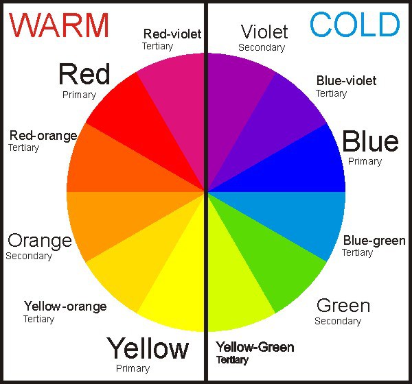
Colour theory is not just knowing what colours are: primary, tertiary etc and how to make them, but understanding cool and warm colours, complementary (next to each other) and contrasting colours (opposites), neutral and bold colours and how colours can affect our emotions or perceptions of a scene.
-
-
- Don’t overdo it. Too much colour or too many clashing colours can be confusing to the eye and create a chaotic scene.
- Consider the time of day and the type of light which can affect how different colours appear.
- If you are not happy with the colour in your image then try adjusting the saturation in post-processing. An image with lower saturation seems softer, dreamy and idealistic. An image with high saturation seems bright and exciting. Think about the feeling you want to convey with your image before deciding how much or how little saturation would best suit the scene.
- Pay attention to the way you frame colour and use light to enhance it.
-
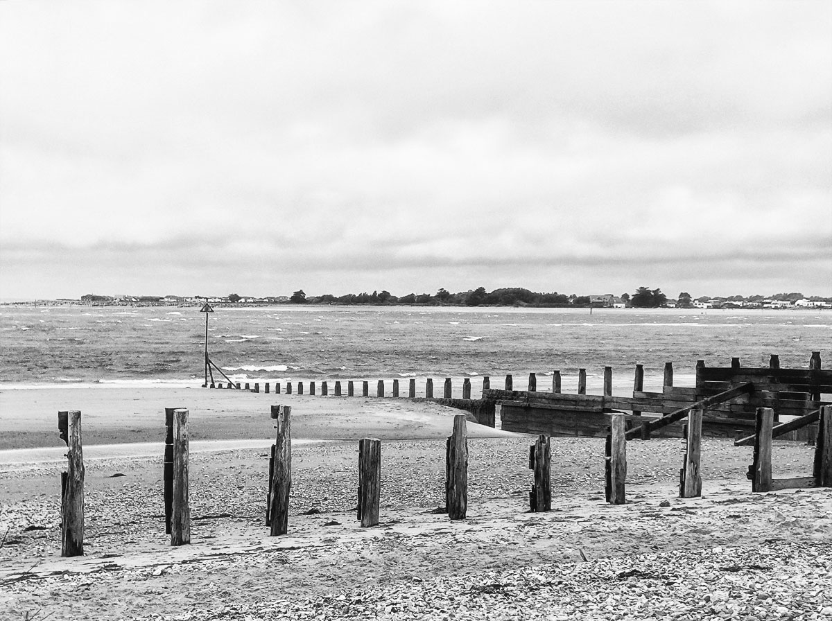
This week's assignment - Take a photo of a subject that you like in colour and then convert to Black & White. Show both images for comparison. Which is best? Does the image rely on colour for impact.
If the colours in your photograph are tonally close the image will lack impact when converted to black and white. Colour can be essential to the success of an image in this case.
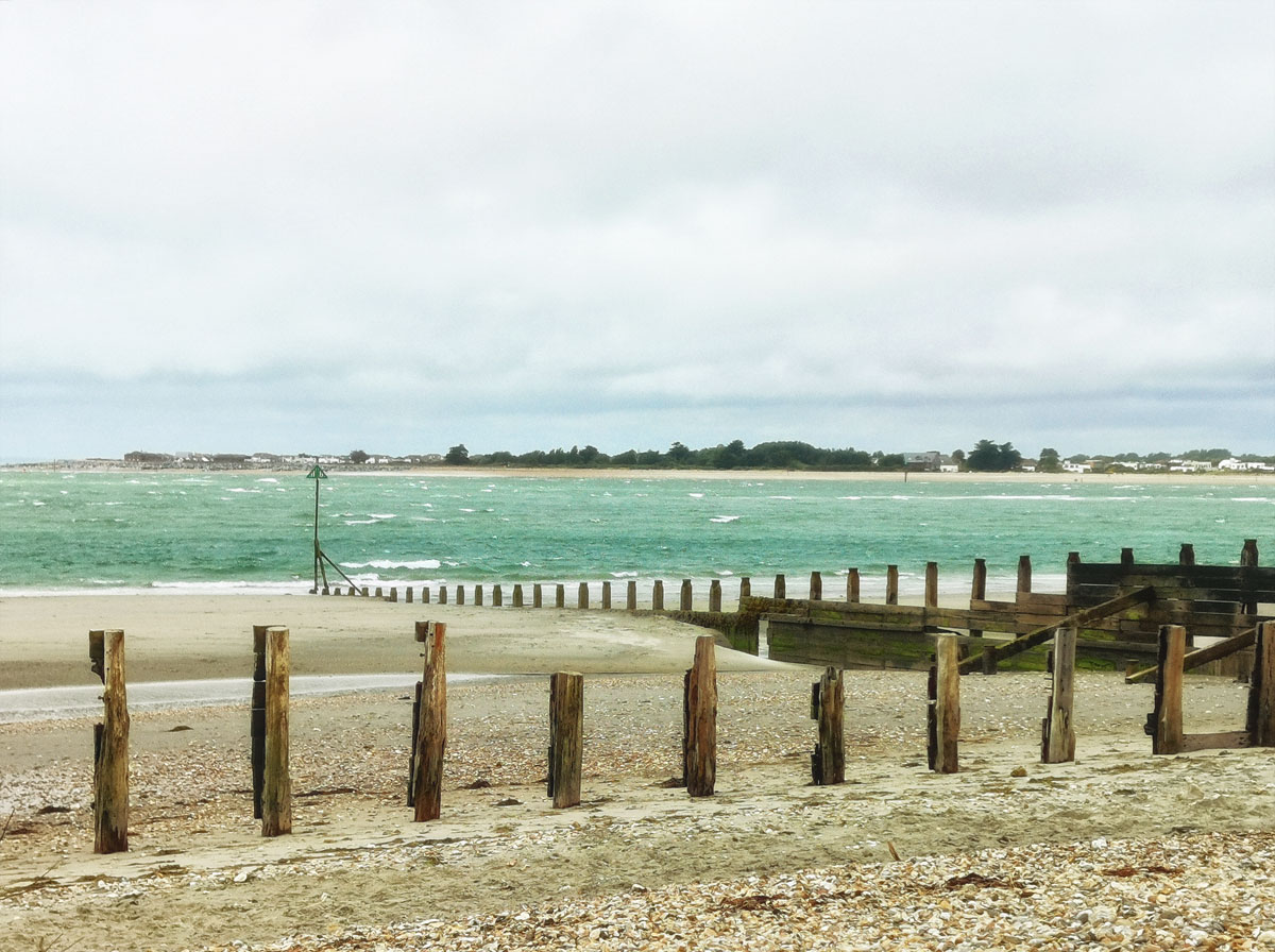
West Wittering beach in colour does not have any dramatic colour contrasts, rather a bleached look which I like and I took this shot because of the lines of the groynes. I think this works in black and white as the posts are still the focus of the shot.
Which do you prefer and why?
If you would like to join in with the 2020 photo challenge then please take a look at my 2020 Photo Challenge page. No complicated rules, just a camera required 🙂
-
- Create your own post with some information about how you composed the shot.
- Include a link to this page in your post so others can find it too
- Add the tag #2020PhotoChallenge so everyone can find your entry easily in the WP Reader
- Get your post(s) in by the end of the month, as the new theme comes out on the first Sunday in September.

I like the black and white, where the two lines of groynes become the subject more assertively. It also reminds me of seaside images from my childhood, which were always black and white.
Ah, yes, the black and white world we grew up in 😁
🙂
I rather like the colour version, it capture the sense of the place and a sense of time too.
Colour winning out so far. My choice too.
🙂
Personally, I go for the B&W….shapes, textures
I thought you might 🙂
😄😄
Although the B&W renders the scene timeless in many respects, I prefer the colour one, which reminds me of a shot taken on real film.
Best wishes, Pete. x
My choice too Pete. I like the softness.
Probably the washed out colour, for the mood rather than anything else. The b & w doesn’t look very inviting. Which do you prefer? 🙂 🙂
I like them both, but my preference is for the colour as I like the softness that came out in this shot. Possibly because it was so windy and the air was not clear (spray/sand). Found you and everyone else in the trash again! I wonder why this is happening?
Good question. Don’t know the answer but Tina said she had trouble commenting on mine. I haven’t changed anything or used Blockbuster yet 🤣. Are you using it? 💕
Yup. Still going into the Trash folder, but you are not alone. I have emailed the Happiness Engineers to take a look so have left your other comments in there so they can see what is going on.
Here’s mine: https://margaret21.wordpress.com/2020/08/25/a-window-into-the-past/ I prefer my less austere versions in colour .
Thanks Margaret!
Both versions have their advantages but for me the summertime shades of the colour image win out. Here’s my response to the challenge and a search through my archive for images that were improved by conversion to B&W: https://beyondthewindowbox.wordpress.com/2020/08/25/in-full-colour/