
August’s theme / technique: Colour Theory
If you want to see what this month’s assignments are in advance then please click here. All the assignments are available from the menu on the left under the 2020 Photo Challenge / Assignments.
Colour plays an important part in what we see. Our brains interpret colour far better than our cameras do. Anyone trying to photograph a red rose will know how often the photograph is very disappointing.
Successful colour photography means learning to use colour as a compositional tool – a form of visual communication – rather than just reproducing a scene that happens to be in colour.
Colour theory is not just knowing what colours are: primary, tertiary etc and how to make them, but understanding cool and warm colours, complementary (next to each other) and contrasting colours (opposites), neutral and bold colours and how colours can affect our emotions or perceptions of a scene.
-
-
- Don’t overdo it. Too much colour or too many clashing colours can be confusing to the eye and create a chaotic scene.
- Consider the time of day and the type of light which can affect how different colours appear.
- If you are not happy with the colour in your image then try adjusting the saturation in post-processing. An image with lower saturation seems softer, dreamy and idealistic. An image with high saturation seems bright and exciting. Think about the feeling you want to convey with your image before deciding how much or how little saturation would best suit the scene.
- Pay attention to the way you frame colour and use light to enhance it.
-
This week's assignment - Capture a scene with strong contrasting colours. Try using a simple composition so they are most effective, often some type of pattern arrangement works best.
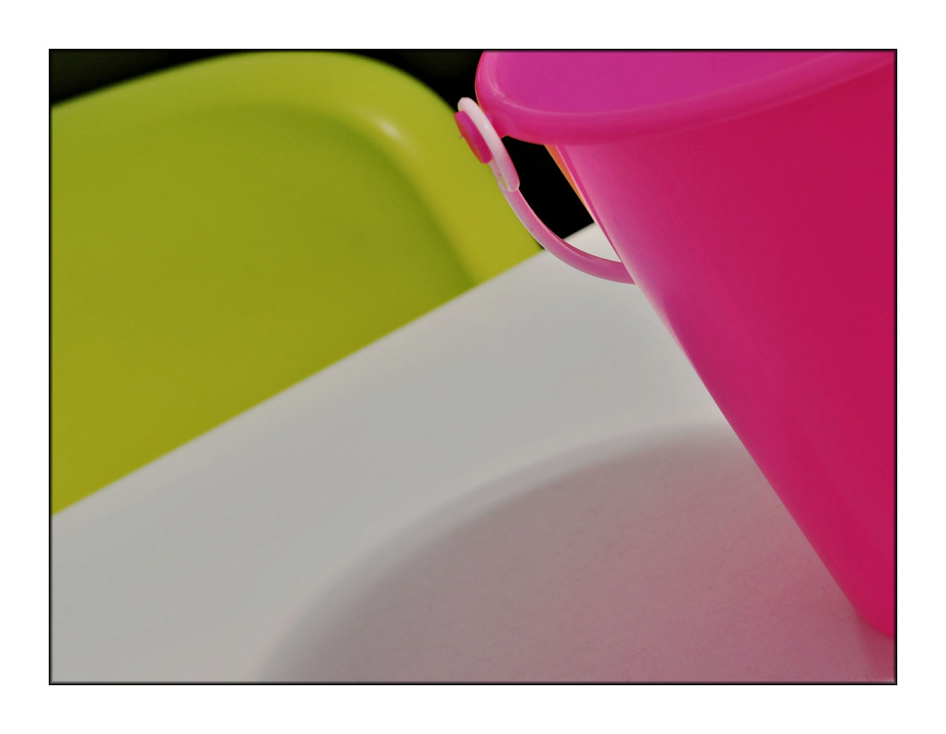
Here I have used a slightly tilted composition to include the back of the vibrant lime green chair with the fuchsia pink bucket (which is used to contain cutlery at a beach café in St Ives) in one shot. This is a very simple colour scheme with few subject elements and the use of black and white clearly demonstrates the strong colours that are well separated from each other on the colour wheel.
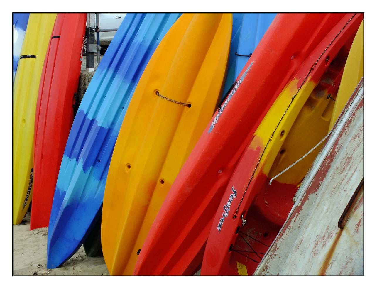
 This next image is one you see all over in Cornish beach towns. Racks of kayaks. These were particularly eye-catching being bright primary colours and I like the fact that they are randomly stacked.
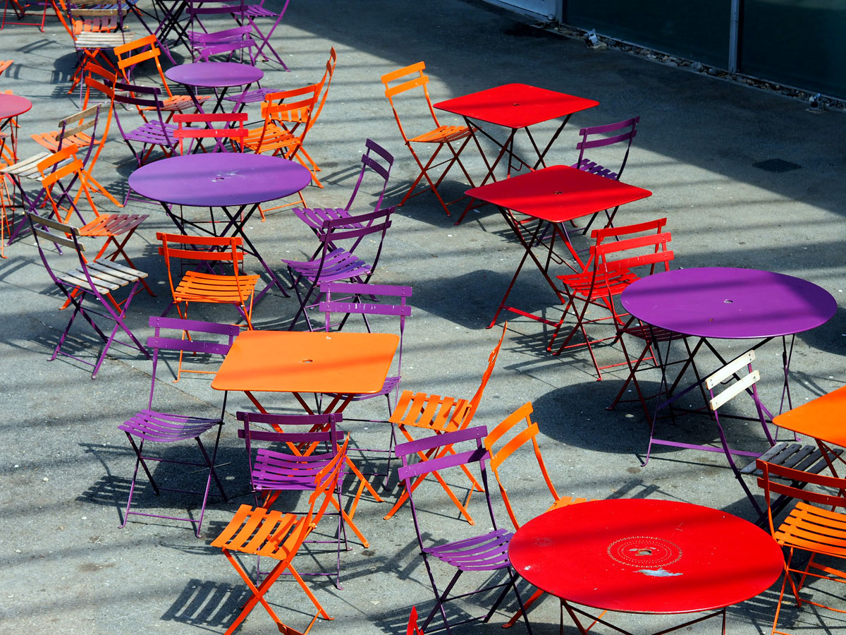
These tables and chairs at the Eden Project are strong contrasting colours and a mix of squares and circles and shadows.
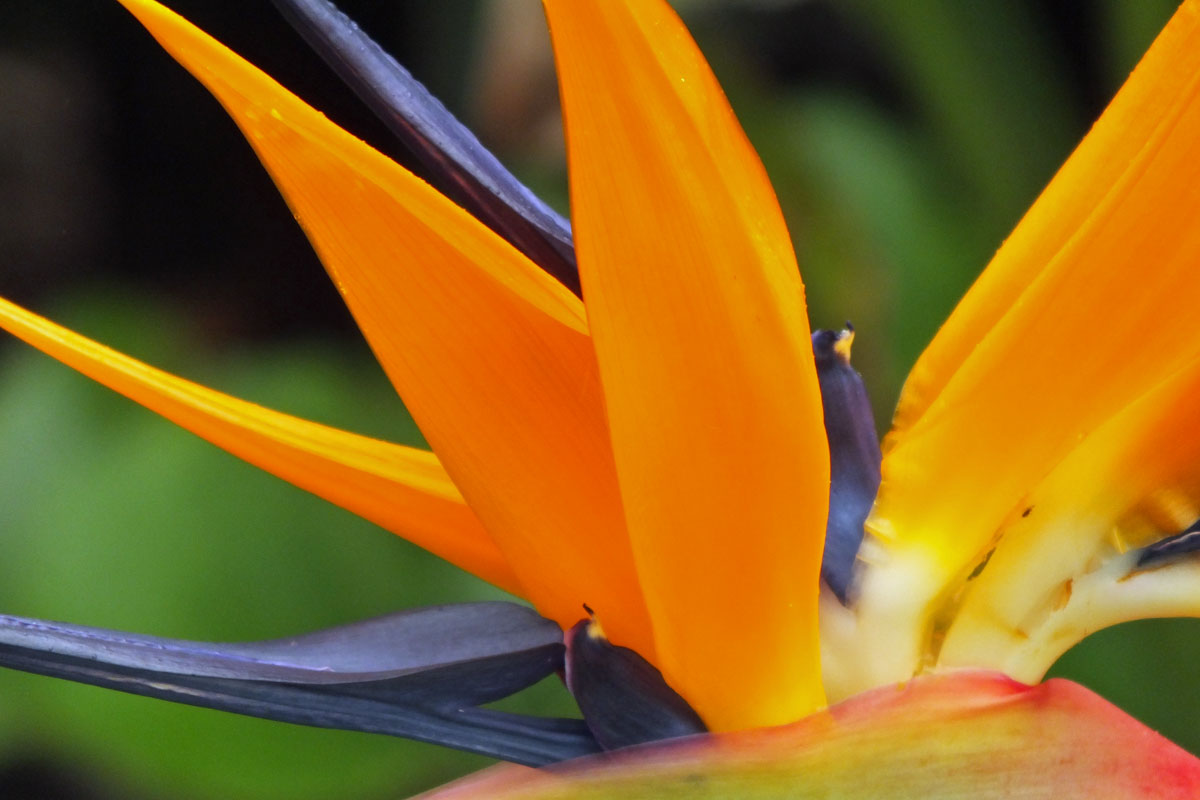
And finally the wonderful natural contrasting colours of the Strelitzia flower which is also known as the bird of paradise plant.
If you would like to join in with the 2020 photo challenge then please take a look at my 2020 Photo Challenge page. No complicated rules, just a camera required 🙂
-
- Create your own post with some information about how you composed the shot.
- Include a link to this page in your post so others can find it too
- Add the tag #2020PhotoChallenge so everyone can find your entry easily in the WP Reader
- Get your post(s) in by the end of the month, as the new theme comes out on the first Sunday in September.

Hello. I nearly missed out for this month. Here’s my contribution.