
August’s theme / technique: Colour Theory
Colour plays an important part in what we see. Our brains interpret colour far better than our cameras do. Anyone trying to photograph a red rose will know how often the photograph is very disappointing.
Successful colour photography means learning to use colour as a compositional tool – a form of visual communication – rather than just reproducing a scene that happens to be in colour.
Colour theory is not just knowing what colours are: primary, tertiary etc and how to make them, but understanding cool and warm colours, complementary (next to each other) and contrasting colours (opposites), neutral and bold colours and how colours can affect our emotions or perceptions of a scene.
-
-
- Don’t overdo it. Too much colour or too many clashing colours can be confusing to the eye and create a chaotic scene.
- Consider the time of day and the type of light which can affect how different colours appear.
- If you are not happy with the colour in your image then try adjusting the saturation in post-processing. An image with lower saturation seems softer, dreamy and idealistic. An image with high saturation seems bright and exciting. Think about the feeling you want to convey with your image before deciding how much or how little saturation would best suit the scene.
- Pay attention to the way you frame colour and use light to enhance it.
-
This week's assignment - Find a monochromatic scene consisting of varying shades of a single colour.
-
- The key to a successful monochromatic image is to find scenes with good contrast throughout the image – you want the photo to have a dark version of the colour, a light one and a good range of tones in between.
- Use Duotone or sepia-toned effects in your post-processing software to create a highly monochromatic scene
- Views of the sea and sky contain a range of different blues
- Sunsets can comprise of mainly oranges and reds
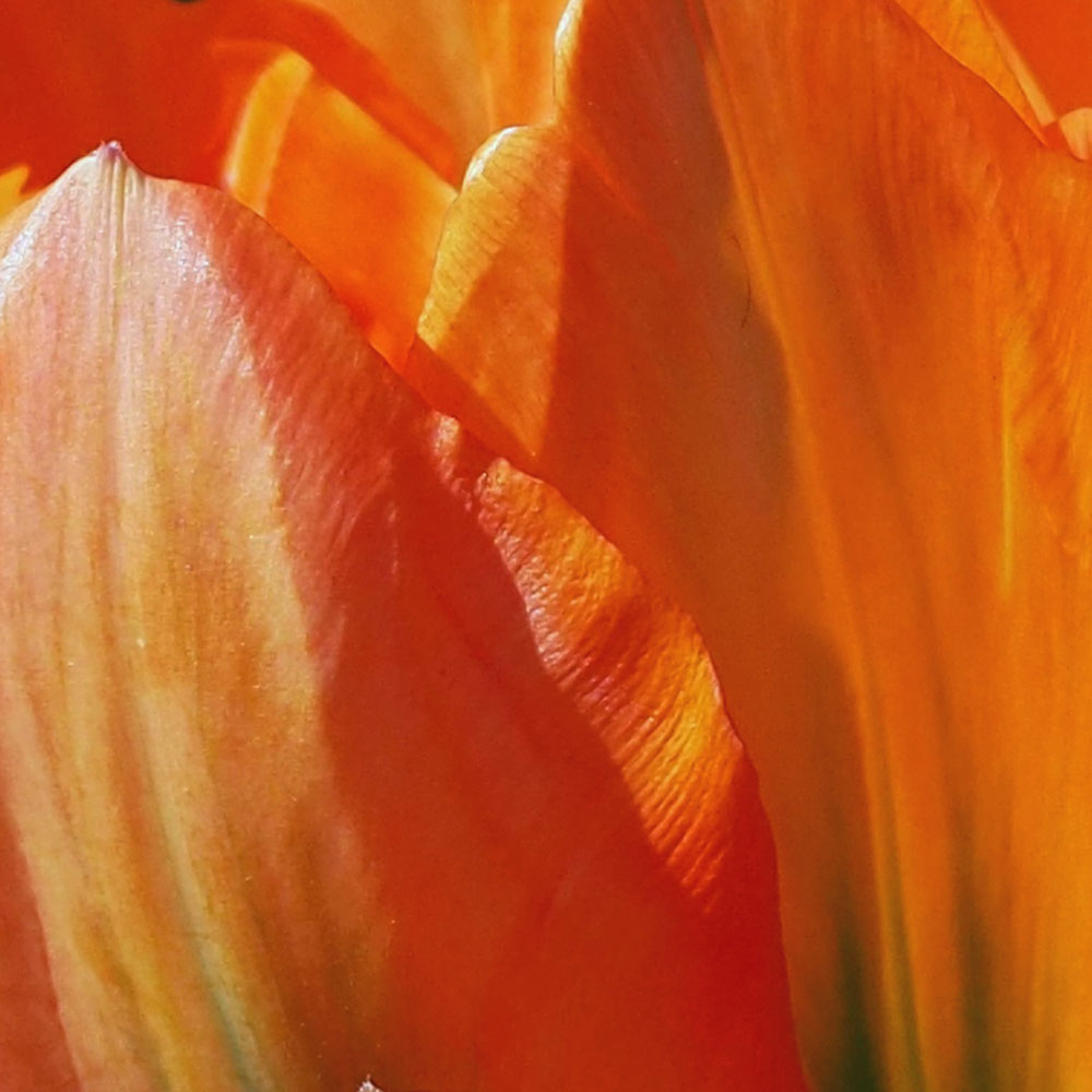
- Flower close-ups often have very narrow, subtle shifts in colour.
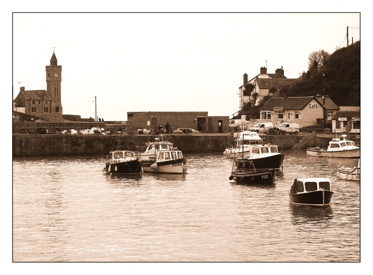
This image of the harbour in Porthleven was taken on a dull day so there are not many shadows, there are however a number of contrasting colours on the fishing boats. I have used a sepia effect in my post-processing software to produce this monochromatic tone,
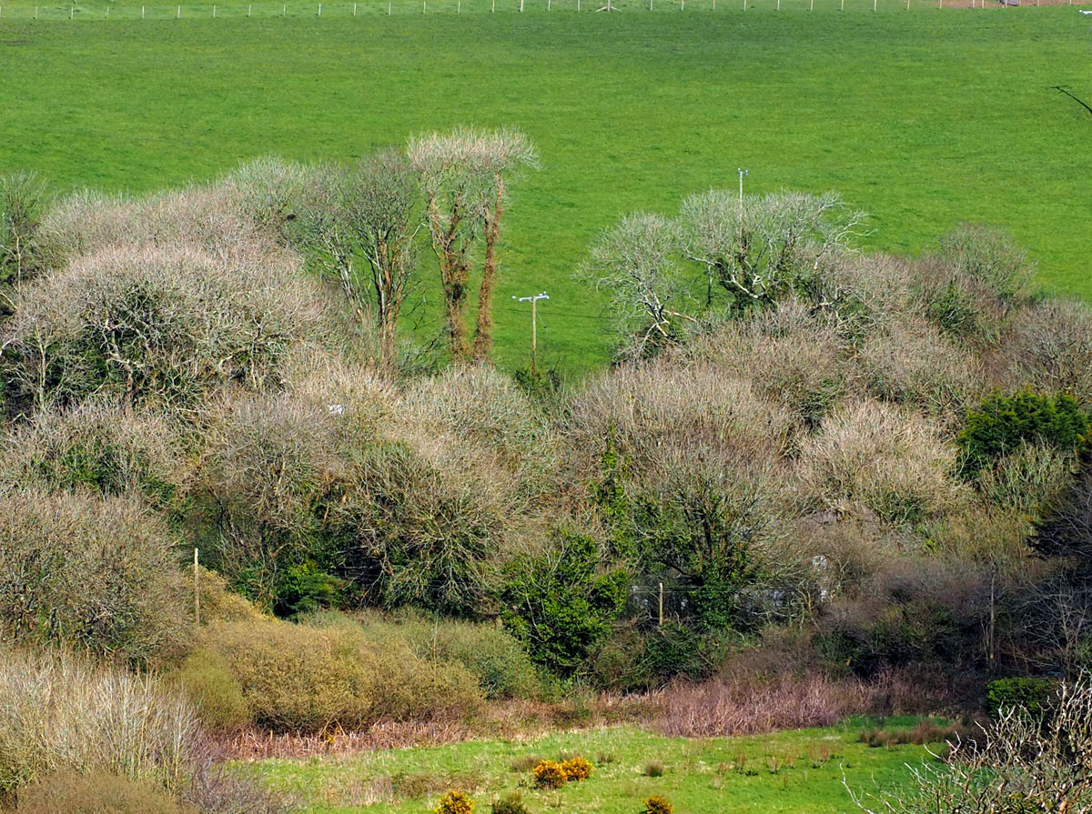
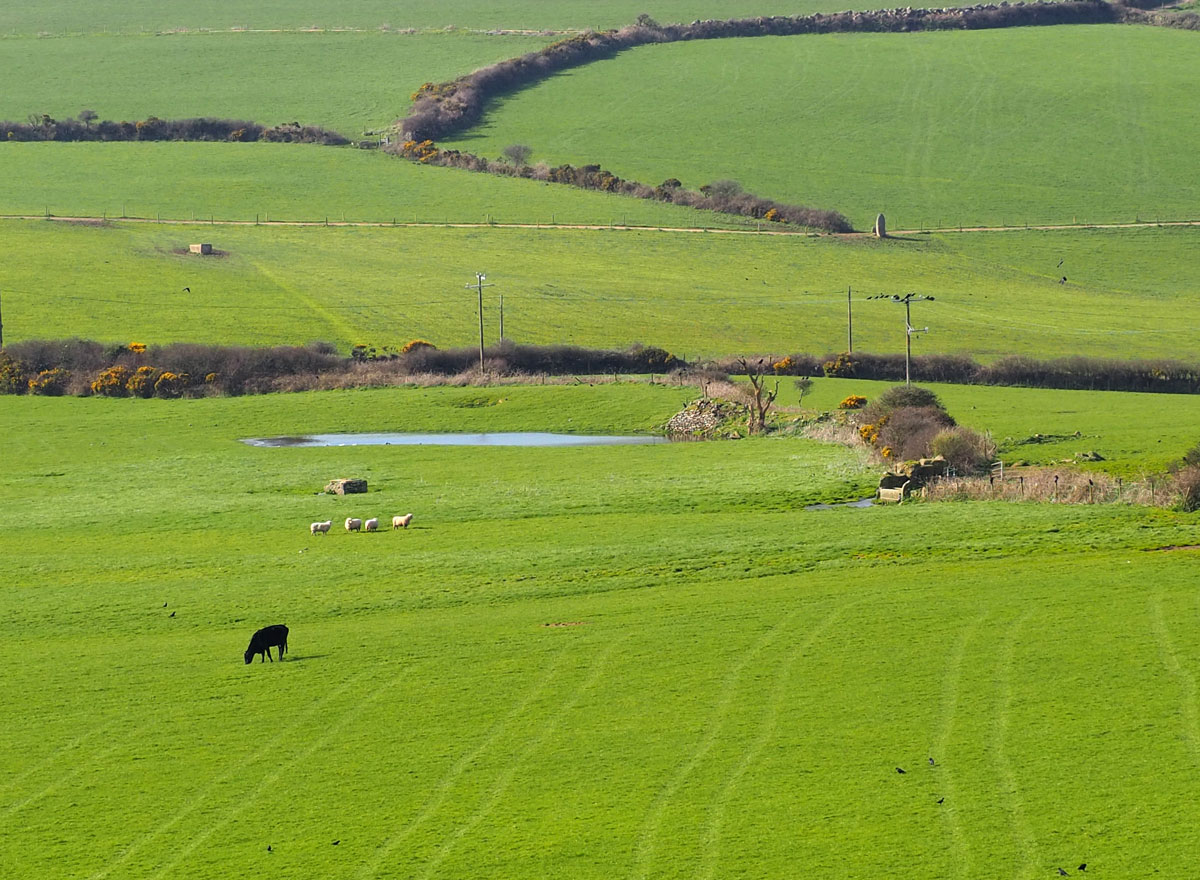
The greens of the countryside
Different tones of orange in a tulip flower
 If you would like to join in with the 2020 photo challenge then please take a look at my 2020 Photo Challenge page. No complicated rules, just a camera required 🙂
-
- Create your own post with some information about how you composed the shot.
- Include a link to this page in your post so others can find it too
- Add the tag #2020PhotoChallenge so everyone can find your entry easily in the WP Reader
- Get your post(s) in by the end of the month, as the new theme comes out on the first Sunday in September.

Here’s my attempt this week: https://margaret21.com/2020/08/13/a-greener-shade-of-green/